The word, avatar, seems to have origins in Hinduism but has only been used in mainstream Internet lexicon for less than 20 years. No kids; the idea of an avatar, Hindu or binary, was not created by James Cameron. Merriam-Webster’s definitions three and four of the word, avatar, are the two uses I will talk about in this post concerning the importance of allowing your logo design and branding to reflect the profile-picture-driven world we face (no pun intended) each day.
I’m an Avatar Living in My Avi World
Webster’s third definition of the word avatar is, “a variant phase or version of a continuing basic entity.” Back when Bulletin Board Systems (BBS) and forums were popping up and accessible from home computers, a cool advent of that time period were graphic enhancements allowing a bitmap to show up alongside your username. We have come to know these as avatars or more commonly refer to them as “profile pics.”
The Internet has forced even the most un-savvy user to put up a profile pic of some sort. Our phones have forced us to embrace the idea of an icon. The avatar, profile picture, and icon embody something bigger than our words can explain. I’m reminded of the beautiful words from the Christopher Nolan film, Batman Begins:
…as a man, I’m flesh and blood. I can be ignored. I can be destroyed. But as a symbol, as a symbol I can be incorruptible. I can be everlasting.
When a company brands or rebrands itself, I find it imperative one consider “It’s hip to be square!” The Internet uses squares of different sizes for the purpose of easily identifying people, brands, and ideas. Everyone uses a square. If your brand’s logo is horizontal or is just long stylized text, it is not the time to say, “We’re gonna need a bigger boat.” But it is time to consider the importance of an alternate version of your horizontal style logo or maybe creating a 1:1 size-ratio-symbol to add to your branded horizontal text logo.
For a moment, consider in your mind some of the largest companies in the world. McDonald’s (1:1 ratio golden arches), Apple (1:1 ratio apple), Microsoft (1:1 ratio butterfly), HP (1:1 ratio text design), Amazon (1:1 ratio “a” design). These designs are quite often used separately from their full text logos. Almost every major brand has this type of alternate logo they can use in subtle ways to create brand association. The reason they work is because they are used and used in a lot of different ways. Every automobile company I can think of uses their symbols more than their text. Why can’t smaller businesses do the same?
Branding for Quadrilaterals
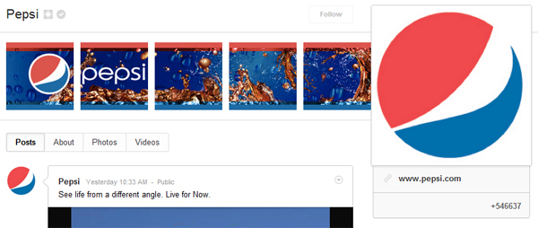
Let us look at two very popular products with historically different types of logos. Pepsi has always had the “Globe” logo to use as a symbol next to, as a backdrop, on top of, or as a stand-alone to the text logo. Coca-Cola® has never used a symbol in addition to or instead of their text logo, save for the bottle-cap logo used occasionally. The Coca-Cola® “Ribbon” is the closest thing the company has had to a stand-alone alternate branding device.
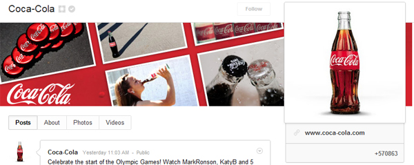
Below are screenshots and links to both Pepsi and Coca-Cola® Google+ Brand Pages. As you can see, the “Globe” logo is used as the profile picture and the text “Pepsi” has been moved to an alternate area, the banner. The “Globe” will serve as the visible logo for brand association for posts by Pepsi appearing in your timeline. It’s subtle for sure and those who are very literal might have an aversion to this type of branding, but I’ll discuss visibility in the Coca-Cola® example.

In my opinion, the Coca-Cola® Google+ Brand Page has a problem as it relates to what I’m suggesting companies do with their branding. The problem this profile pictures has is a lot of white space and minimal branding. Before the white space lovers send me scathing emails on design, let me say I love white space. I love subtlety and minimalistic, think-for-yourself design. In fact, if you’re paying attention, the red Coca-Cola® bottle design on a white background is part of the company’s current branding push. This minimalistic alternative to the Coca-Cola® text is a stunning visual on HDTV or movie-theater commercials.

My issue with the red bottle design is visibility and size. Profile pictures, especially those in your timeline stream or icons on your phone are small in nature. Can you see on your phone or your timeline stream the words Coca-Cola®? Would your company’s logo or text be visible in a small 50×50 pixel icon on your phone? Specific pages have larger versions of these icons or avatars, but most of the impressions a consumer sees come from a timeline or news stream. I contend one should want to maximize the space given to them considering its small size and fill that square avatar with a 1:1 sized logo or alternative branding like the Pepsi “Globe.”
One might ask why Coca-Cola® has never created an alternate logo. Honestly, I cannot answer that question but I don’t think it defeats my reasoning for other, less established brands to create one for the profile driven era we operate in each day. At this point in history, they are Coca-Cola®, how much more aware could one be of them?
Think Inside the Box
Consider your current logo and branding. Does your company fit inside a box? If not, I think you should take some steps to better brand yourself and increase your visibility for your online properties and for all your other marketing efforts. A symbol, as mentioned in the quote from the movie Batman Begins, is everlasting and if used in the right way can come to mean so much more than you could ever say about your service or product.
- Create a smart but effective 1:1 size ratio symbol for your business.
- Don’t be too literal with it! Don’t be afraid for your logo/symbol to have nothing to do with your service or product. Think about how little the outline of an apple has to do with computers.
- Maximize your space and consider the medium with which these avatar, profile pictures, and icons will be viewed. Most of them are small so fill the white space.
- Use the icon everywhere you can, especially online? The apple didn’t become a symbol for computers overnight; nor did the “golden arches” become a symbol for fast-food hamburgers by hiding the yellow M.
Take some steps to move toward immortality and think inside the box.


One thought on “Logo Design & Branding: It’s Hip to Be Square”
Comments are closed.