In my last post, I introduced you to the concept of responsive web design. I want to take this one step further and begin the actual implementation. Just to refresh, responsive web design combines fluid grids, CSS3 media queries, and flexible images to allow a website to adapt to the screen size of the user. Today, we’ll start out with fluid grids. Once again, we have Ethan Marcotte to thank for this information. He uses a slightly different method than I will use here, but he has definitely laid the foundation.
For demonstration purposes, I’ve gone ahead and created a pretty little grid that spans 980 pixels wide.
This particular grid consists of seven columns that are 120 pixels each, with a 20 pixel gutter, and 10 pixels to the left and right of the outermost columns. Keep in mind, you can use any combination of number of columns and respective widths. A very popular width is 960 pixels because it easily divides into a multitude of column combinations.
I’ve also created a very simple website layout that has a basic header, content, sidebar, and footer.
Again, this will vary with each site. Now, in order to achieve a fluid grid, we will have to manipulate this grid just a tad. It’s not very fluid at a fixed width of 980 pixels, so we’ll need to use percentages.
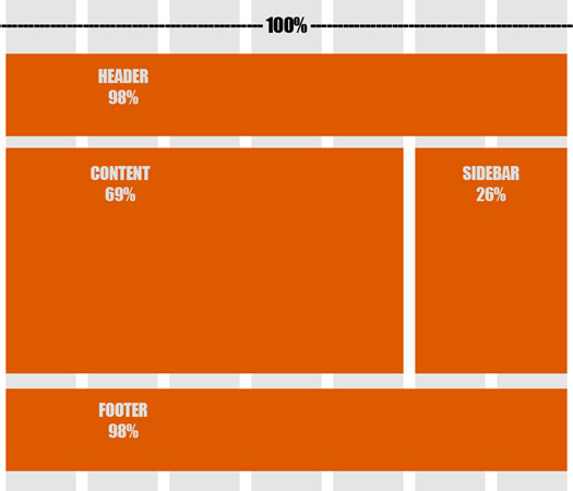
The outermost wrapper of 980 pixels will become 100% since this is the widest element. To convert the rest of the layout, all we need is some basic math. The header can be calculated by dividing:
960 pixels / 980 pixels = 0.97959184
At this point, we convert our decimal into a percentage and we get 97.95%. For browser compatibility purposes, we’ll round this to 98%. We’ll need to do the same to get the percentage of our content, sidebar, and footer:
content: 680 pixels / 980 pixels = 0.69387755 → we’ll round to 69%
sidebar: 260 pixels / 980 pixels = 0.26530612 → we’ll round to 26%
footer: same as header → 98%
Let’s take a look at our layout now:
As you can see, our once fixed layout is getting closer to becoming a beautiful, responsive website. To take it a little further, I’ve created a basic web page as an example, aptly named “A Responsive Site.” If you shrink your browser window, you’ll notice that the elements adapt to their appointed percentages in relation to the window size. Keep in mind this is only one step in the right direction. There’s still some tweaking to do if we want this site to not only respond to users’ screens, but to also be visually pleasing and readable on all devices. Next time, we’ll delve into some CSS3 media queries to get us even closer to a fully functioning responsive website.


Hey Kim.Working with fluid grid is totaly depend and vary upon websites . you have presented very well as it is also the important aspect of responsive design. Thanks .